Invoices are more important than you might think. Every business, regardless of how big or small, will use invoices on regular basis to charge their clients and customers for services that they have provided them with. When you look at it from that perspective, it’s quite obvious that you have to pay special attention to these documents. However, many don’t.
It’s not uncommon to see a plain-looking invoice that just gets lost in the piles of other documents. Now, we don’t have to point out that that’s not good. A quality invoice should stand up. It should represent you and your brand and it should look professional before all else. Considering the number of plain, non-professional looking invoices out there, we feel like it’s safe to say that that’s easier said than done, making it look professional, that is.
On that note – we’re extending a helping hand. We’re going to go over some clear, tell-tale signs that your invoices need to look more professional and how to make them as such. So, without further ado – let’s get started.
1. You’re Not Getting Paid On Time

This should be a clear sign that there’s something off with your invoices. If you’re not getting your money on time or your clients are constantly late on their payments, the problem might not be in them – it could be the invoice. Cleaning up your design and paying special attention to a few key areas could make the difference between getting your money on time, rather than sending a follow-up document to remind your clients it’s payment time.
2. It’s Looking Boring
If anyone ever tells you that professional, formal and boring are pretty much synonyms – we urge you never to take advice from that person ever again. Under no circumstances should you have to make anything “boring” just because it’s supposed to be professional. That’s just not the way it goes. Quite the opposite, in fact. if you send your client a plain, boring document, they’re going to feel like you don’t care enough to put in some extra work into a financial document and what’s more unprofessional than not caring about your business?
3. The Terminology Is Unclear

One of the mistakes people make when designing invoices is they try too hard to be professional and they end up using a language that is unclear and ambiguous. You don’t have to sound posh and preposterous just because you want to look professional. Use standard terms and language when designing your invoice. If your clients can’t understand the service or item descriptions or what you’re charging them for – you won’t get paid. Nobody’s going to care about your vocabulary, either way, so stop overcomplicating things. Professionalism lies in simplicity.
4. You’re Not Using Templates
There are a few things every invoice should contain and if you’re not following those rules you can easily end up with a lousy drafted document that looks both unprofessional and won’t get the job done. On that note, if you’re not sure about what should a professional-looking invoice contain – do yourself a favour and take this advice from Billdu and yours truly – use pre-built templates.
By using invoice templates you can find online, you’re making sure you’re not missing out on anything. All of these are done by professional designers and people who understand how this document should look and what it should contain. Because of it, you don’t have to think about it too long and hard and you can just pick the one you like the most, make a few adjustments here and there and voila – you have yourself a unique, professional-looking invoice. Proper B2B invoicing practices are essential for getting paid on time and maintaining a professional image for your business. For more information on this, you can check out Unimaze’s guide on B2B invoicing.
5. You’re Not Branding

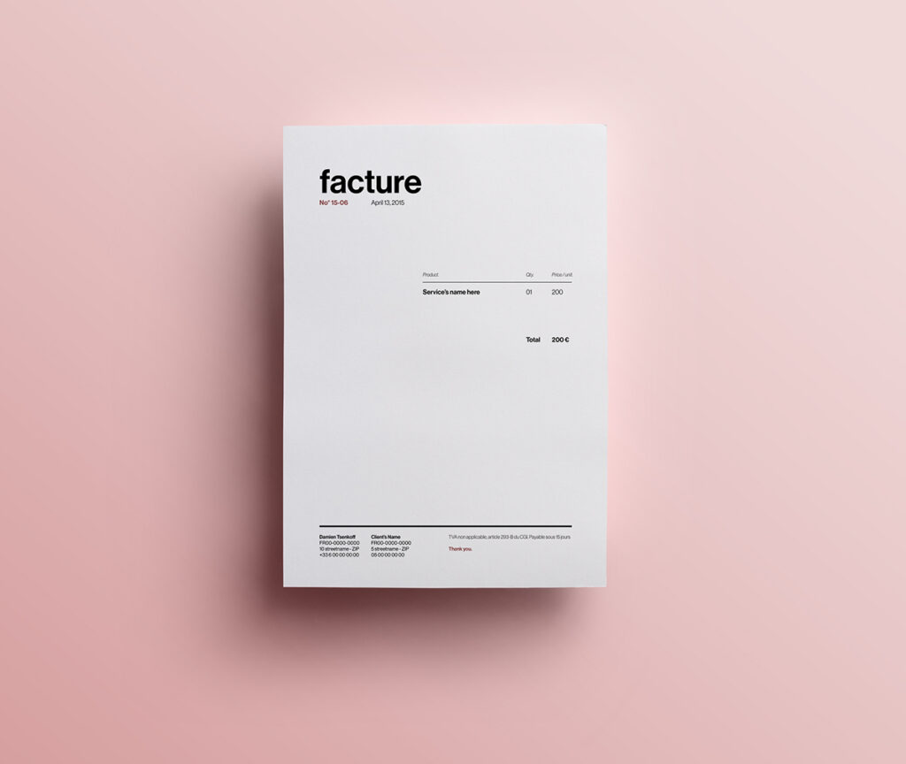
Even though the main purpose of the invoice is pretty straightforward, it’s far from the only purpose this document can have. What many don’t realize is that you can use an invoice as a marketing tool – if you design it properly. Now, whether you use a template, hire a designer or if you make the invoice yourself – you should always brand it. Every invoice should have a touch of your brand. A header should contain the company logo and the rest of the invoice can be styled in your company’s colours. As you can see, we’re not talking about some ludicrous personalization or branding – just a simple colourway and a logo should do.
6. You’re Using Comic Sans
No, we’re just kidding, No one in their right mind would use this font for an invoice.
7. You’re Not Highlighting The Payment Details

As we’ve said previously, the main purpose of this document is pretty straightforward – it’s there to get you paid. However, how can you expect it to get you paid if you don’t highlight the payment details? You should never let payment details blend in with the rest of the information found on the invoice. Place the payment totals in the obvious place – the bottom right corner for instance. Also, make it slightly bigger and bolder – you can add some colour as well. Just make it obvious, in a non-obnoxious, professional manner.
8. You’re Not Listing The Services Properly
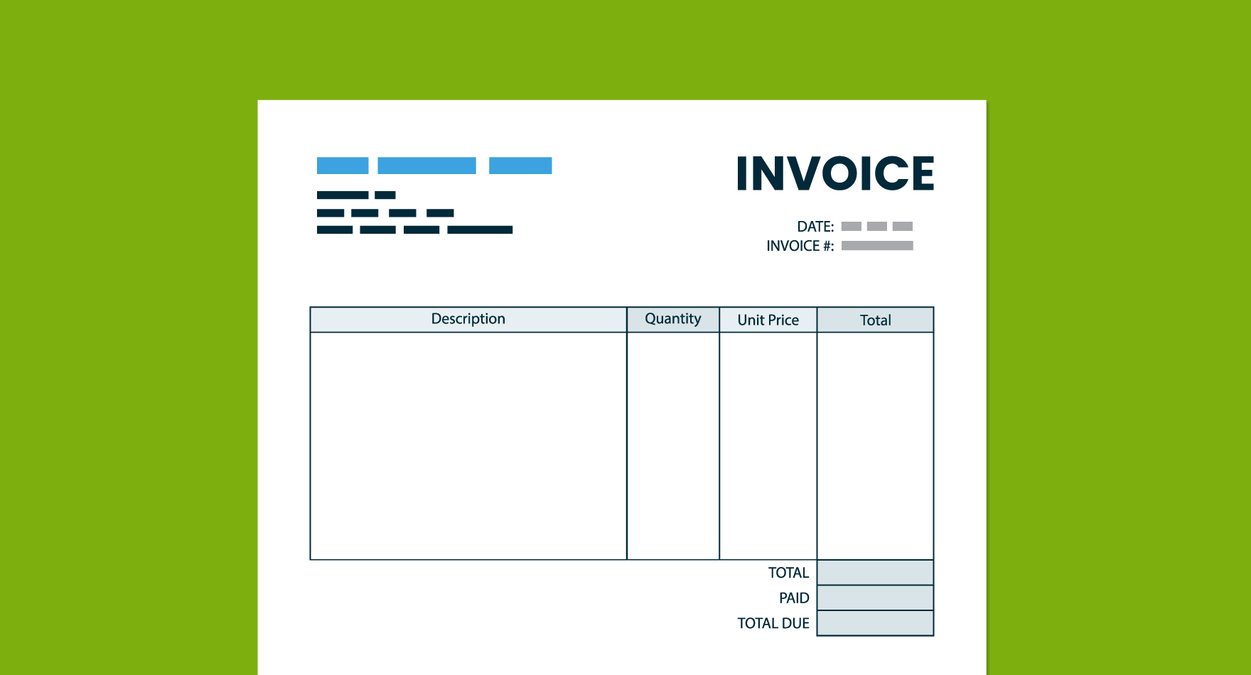
People like to know what they’re paying for, you’d agree, right? Having an itemized list of the services or products provided is one of the most important aspects of an invoice. However, it’s not enough just to list the items or services and stick the price beside it – that just won’t cut it. Each individual item should be properly listed and described. For instance, if you’re selling products, a product name, brief description, quantity and price per item should be right on there. As far as services go, once again, the name and the description is a must. As far as quantity goes, if you’re charging by the hours – put that on there, as well. Being clear and transparent is a must if your goal is to look professional.
Now, we could go on and on about the small, intricate details you have to pay attention to, but we thought it would be much better to focus on the major points first. Once you cover the basics, you can then focus on the details.
All in all, if you want a professional invoice – take this advice. Brand it, make it simple and be transparent. That’s the main thing. If you are good on those three, everything else will fall into place. Hopefully, we’ve been helpful. Take care.


