
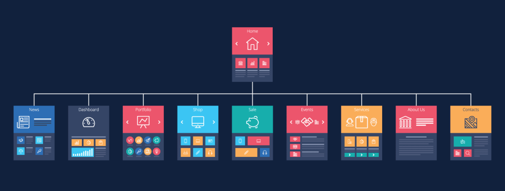
Most business owners spend a lot of time thinking about product pricing, ads, and design. Fewer people stop and ask a simpler question: can visitors actually move through the website without friction? That detail affects order value more than many realize.
I’ve seen stores with strong products lose sales because customers got stuck between categories, confused by navigation, or overwhelmed by cluttered layouts.
People buy more when the experience feels organized and easy to follow.
Why Structure Changes Customer Behavior

Website structure affects how long visitors stay, what they click, and how confident they feel while shopping. A messy structure creates hesitation. A clean one encourages exploration.
One thing I notice often is businesses treating their menu like a storage closet. Every category gets added. Every page becomes “important.” Then customers land on the site and have no idea where to start. Have you ever opened a website and immediately searched for the search bar because the menu made no sense? Most people have.
A company like Digital Heroes understands this well because structure is tied directly to conversions, not just aesthetics. Better organization helps users discover related services and products naturally instead of forcing them to dig through disconnected pages.
Research found that 37% of users abandon purchases because of poor navigation and UX issues.
Small signs your structure is hurting order value
- Customers view products but rarely add complementary items
- Important categories are buried too deep
- Mobile visitors leave quickly
- Users rely heavily on search instead of navigation
- Checkout pages feel disconnected from browsing flow
Clear Navigation Helps Customers Buy More
People rarely arrive ready to buy the highest priced option immediately. Most browse first. Good structure helps them build confidence while moving through the site.
A simple navigation path can quietly increase cart size because visitors keep finding useful additions. Related categories, smart internal links, and logical menu labels all support that process.
| Structural Element | Effect on Order Value |
| Clear category labels | Faster product discovery |
| Related product pathways | More cross selling opportunities |
| Sticky navigation | Longer browsing sessions |
| Shallow page depth | Less frustration |
| Mobile optimized menus | Higher mobile conversions |
Intuitive navigation reduces friction during shopping journeys and supports higher conversion rates by simplifying product discovery.
I always tell people the same thing here. Customers should never feel like they are solving a puzzle just to browse your products.
Internal Linking Quietly Influences Bigger Purchases
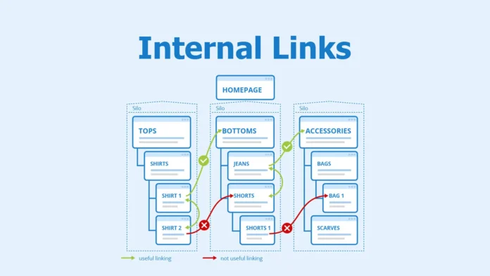
Internal linking does more than help SEO. It shapes shopping behavior.
Think about the last time you ordered food online. You probably added something extra because the platform suggested it at the right moment. Websites work the same way. Smart structure creates natural paths between pages.
For example, someone reading about beginner fitness equipment might naturally move toward accessories, guides, or bundles if the links make sense. Without those pathways, visitors often leave after viewing one page.
Important note: Internal links should follow customer intent, not company departments or internal naming systems.
Navigation taxonomy acts as the “discovery backbone” of ecommerce experiences because products customers cannot locate will never convert into sales.
That sounds obvious when you read it. Still, many websites accidentally hide profitable products behind poor organization.
Mobile Structure Matters More Than Most Owners Think
Mobile users behave differently from desktop users. They scroll faster, lose patience quicker, and make decisions with less tolerance for confusion.
I’ve reviewed mobile stores where the desktop version looked perfectly fine, but the mobile navigation required six taps just to reach product filters. Most users will not tolerate that.
TechRadar reported in late 2025 that 57% of global ecommerce sales occur on mobile devices, while confusing interfaces push users away within seconds.
A few practical mobile fixes that often improve order value
- Keep menus short and direct
- Show popular categories immediately
- Reduce oversized banners
- Use visible filtering tools
- Keep checkout steps minimal
Did you know?
Wikipedia’s widely discussed “three click rule” may not be a strict rule anymore, but usability experts still agree that people expect information quickly and become frustrated when navigation feels inefficient.
That frustration directly affects revenue.
Better Structure Also Supports Trust

People spend more money when a website feels reliable. Structure plays a big role in that feeling.
Clear navigation, logical categories, and consistent layouts signal professionalism. Confusing structures do the opposite. Visitors start questioning the business itself, even if the products are good.
I’ve personally left websites with decent prices simply because the pages felt chaotic. If customers cannot predict where information lives, they hesitate before purchasing. That hesitation matters.
A 2026 ecommerce design study published on ResearchGate recommended user centered testing and responsive design improvements because website structure strongly affects trust and long term customer relationships.
That point gets overlooked constantly. Higher order value usually comes from confidence, not pressure tactics.
Final Thoughts
Better website structure does not mean adding more pages or complicated features. Usually, the opposite works better. Clear categories, logical navigation, useful internal links, and simpler mobile experiences help customers move comfortably through the site.
When visitors feel oriented, they browse longer and buy with less hesitation. Higher order value often grows from those small improvements. Not from flashy redesigns. Not from aggressive popups. Just from making the experience easier for real people to use.